
Did you know that a Product Page is one of the most important places in your eCommerce store? In this article we will share our experience in polishing it up so that will bear significant fruits in the future.
Drop shipping store management is not only about technical setups, design and all that stuff – it’s also about appearance and appeal. Even the tiniest details matter, so let’s explore your eCommerce product pages layout to make it look perfect.
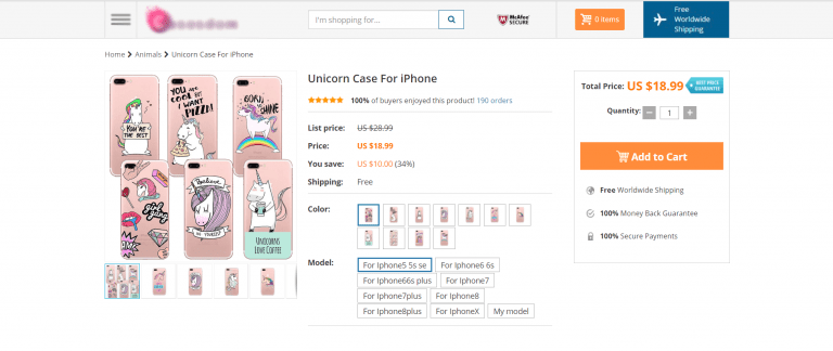
A Product Page really has an impact on your customers’ mood, their desire to buy something and their vision of your store. Moreover, there’s no sense in promoting your products if your eCommerce pages aren’t in order. A potential customer clicks on the link in an ad, gets redirected to a Product Page or some category, and then he… closes the page. Why? The answer is simple: misspellings, low number of orders, no social proof and other mistakes on a Product Page that can really lead to repelling clients, wasting money and failing all your promotional campaigns.
In this article you will find a very useful check-list of the steps you should make for a eCommerce Product Page optimisation and some main points you should always keep in mind. Get ready – you are about to learn how to keep your money safe with well-prepared Product Pages!
eCommerce Product Page Optimisation Step 1. Nice Title
A good product name:
- Is not very long
- Includes key words – use terms your potential customers will be searching for
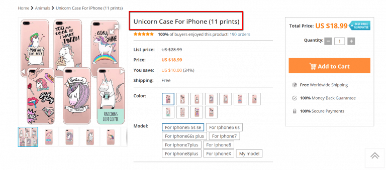
- Doesn’t contain all the variations of your product. Compare: the first product name looks minimalistic & esthetic while the second one is too hard for comprehension and looks massive.

If we want to note that you have several variations of this product, we just write a number of variations in the title or compile all (or some part of) variations in a preview image.
Step 2. Changed Permalink of Your Product Page
Make sure the permalink of a product page doesn’t reflect the link of this product on AliExpress. Firstly, it could reveal to your clients that you are not a manufacturer but a reseller. Secondly, it seems pretty messy. Look:
![]()
The following one is better, right?
![]()

Step 3. Cool Product Description
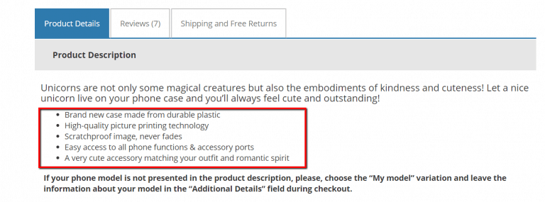
It should contain some kind of introduction that presents your product to customers and involves them deeper into the item description.

Then introduce 5 and more bullet points describing item’s advantages and what’s in it for customers. Will it make their lives better or take away some problems? So, making a buying decision must be a positive and necessary experience for your client.
Note: we use different font characteristics – to divide intro, bullet points and other paragraphs in Product Description and make it look well-structured.
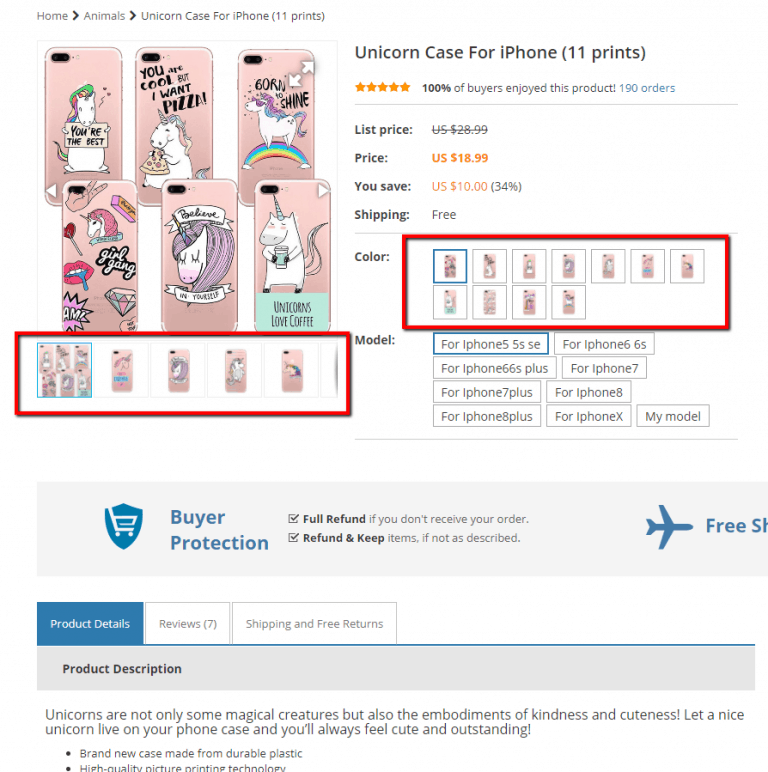
Do not include any images in the Product Description field – it will help to distinguish it from product descriptions on AliExpress and bring a touch of comfortable minimalism to your store. All photos of an item should be displayed in the Gallery and Variations sections and will be easy to access.
If you sell clothes, accessories or gadgets, add some specifications such as size charts, materials, size dimensions and others – it will help customers learn everything about the product and make their buying decision easier.

Step 4. Correct Price + Discount
The price should not be too high or too low. High prices can repel customers from any store at a blink of an eye! Low prices, on the contrary, attract a lot of customers, but we also shouldn’t forget about our revenue, right? So, keep prices moderate. Spying on your competitors’ prices won’t hurt too.
Add a discount by overcharging a Product price – more than 20-30% off is like a nice allurement to customers.
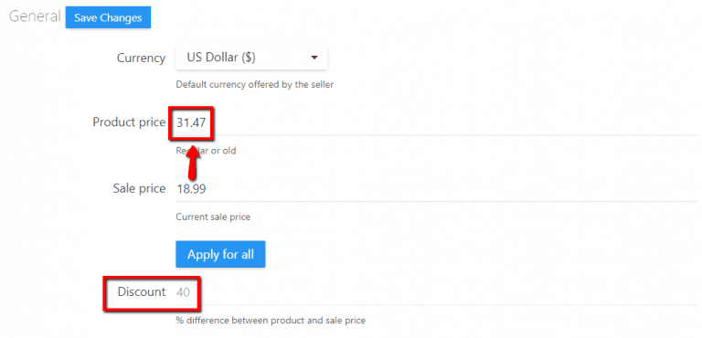
Next, make sure all prices look and sound(!) good. A good price ends on 5, 7 and 9 and is briefly pronounced – it really affects the decision-making process of an online buyer.

Step 5. High Product Rate
An average rating of your product should be high. At least, higher than 4,5. Yep, that’s obvious, but it is the very first thing a customer looks at before making a final decision to buy a product and we should remember that.

Step 6. Enough Number of Orders
Is this product I’m about to buy popular? Hmmm, there are 547 orders – so there’s something in it lots of people like. Probably I should buy it too!
That’s not a textual quotation but a very likely inner dialogue of a customer who considers buying your product. So, no comments are needed here – just keep a number of orders high enough.

Step 7. Right Variations
Our practice has shown that no matter how much products you have to download, you should always check variations section for each product after downloading it from AliExpress. For example, it may contain such ‘gems’ as “XL Asian Size” or “Material” instead of “Model” or even spelling mistakes.
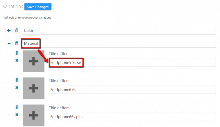
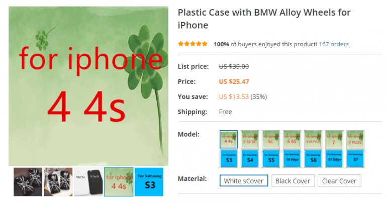
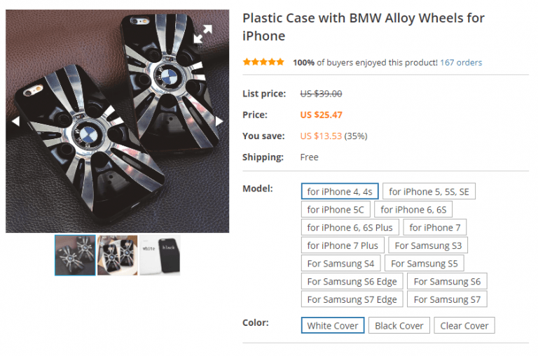
Also, take a look at variations pictures – if there’s an ugly red text on a white or green background, it’s better to delete such pics and type the text from them into the Title of Item field.
Bad:
Good:
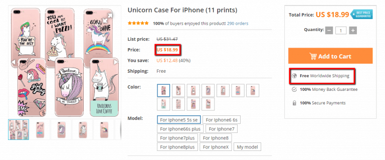
Step 8. Free Shipping
Usually, it’s better to have a little bit higher price but free shipping rather than a low price plus shipping fee. Products with free shipping are easier to promote – they look more attractive to customers who want to see an ultimate, final price at once. In addition, getting something for free always feels rewarding and inspirational, so, give your customers the opportunity to get such a feeling.
Step 9. Attractive Gallery
A nice and appealing Gallery contains the most colorful and good-looking items pictures (3+), others are in Variations.
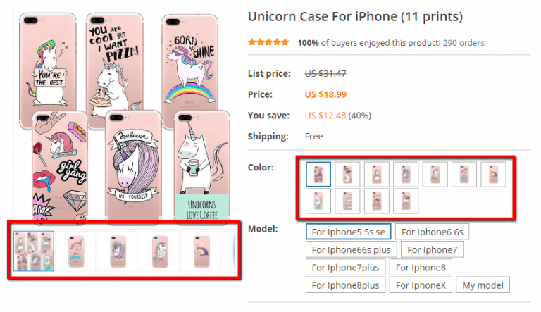
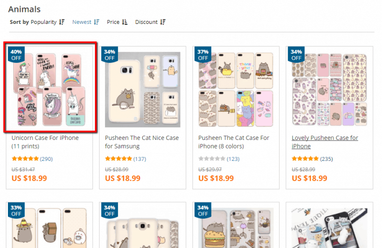
The 1st picture in the gallery should be a picture preview from the category page. Why? So, let’s say, looking through some category, a customer likes an item and expects to take a closer look at it on the product page. But when he’s redirected there this product is gone! We know that it is surely somewhere in Variations or Gallery, but a customer can be too busy or, frankly speaking, just lazy to search for it. So, he or she closes the page – and puff! a customer is gone. We don’t need that.
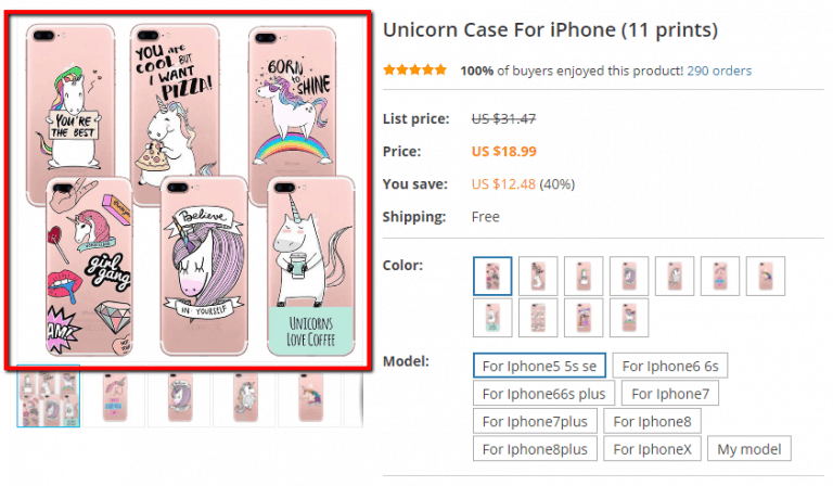
Make sure that the quality of pictures is high – it always makes a product look more expensive and valuable. Don’t forget to delete all watermarks and AliExpress stores labels, Photoshop helps here.
Step 10.Chosen Cross-selling Products
This is a very useful section – your customer will see more products of your store he wasn’t really intended to buy but can be actually interested in. A good trick to lure your customer into further browsing through your eCommerce store 😉
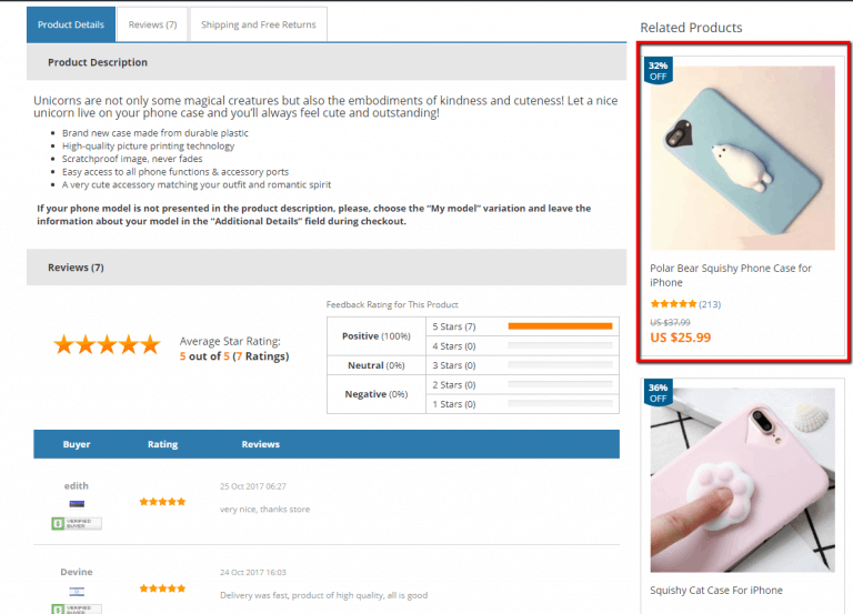
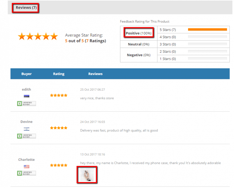
Step 11. Enough Reviews
To increase customers’ loyalty and decrease their hesitancy to buy add more than 7 reviews (the more the better) from 1st world countries customers and photos of your product from them.
Step 12. Right eCommerce SEO
Check check check! Correct eCommerce SEO allows your customers to search for your product on Google or other engines faster and it is used when creating a post with your product on Facebook or Instagram via SocialRabbit.

Apart from these 12 steps you can also follow some optional ones. For example:
- Adding one product to several categories (i.e. a scarf to both Best Sellers and Warm Clothes sections) – there’s a higher chance the customer will see it.
- Placing some videos/guides how to use/YouTube reviews/gifs in Product Description. If a customer likes your product, he will definitely like it even more if you will show him its’ functionality and advantages in video format.
